12/29/2010

ALTERNATIVE LOCATION

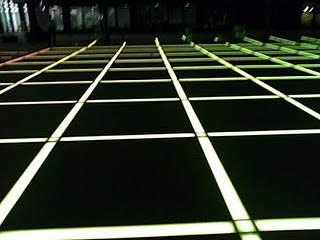
On the day of shooting (Saturday 27th November 2010)
We were unable to shoot at one of our locations (Finsbury Park square) with the floor that lights up.
We had asked an on site security guard, who'd informed us that we were not permitted to film anything or put our tripod down unless we got permission from the council.

I then contacted Broadgate Estate Council/EMO office and was informed that filming there was free of charge for students but due to their busy schedule they could not fit us in to an available time slot for us to film there.
  Overall, we were unable to shoot here, especially due to our tight time schedule.


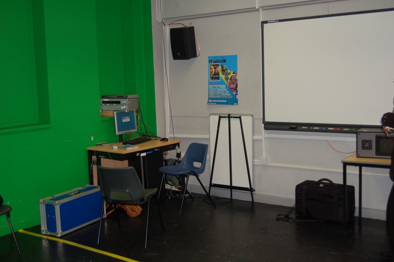
Alternatively we decided upon shooting this scene at a different location- Beach studio at Stanmore College.
We chose to film here because we could get near enough the same effect; a dark room, borrow lights from the media department and put the spotlight on the artists' legs ( just above the knee- using the rule of thirds) and eventually tilt up the artists full body & face.

12/07/2010

CALL SHEET.........#3

CALL SHEET ......NO.3
  
Director: Ariba Ahmed (myself)

 Contact: mobile number: 07581474557

Email: 

Location:
 Drama Hall (Beach)
Stanmore Sixth Form
Elm Park, Stanmore
Middlesex HA7 4BQ

Production Manager: Warsan Bargadle  Editor: Estella Ossei 
D.O.P: Ariba Ahmed(Myself)/Nora Bubale
Unit Call: 11.00am   Tuesday 30th November 2010

On Location:
11.00am Tuesday 30th November 2010
Sets: Black curtains but low lighting/darkness makes it just look like a  black background    
  Shot nos:...
Artist:
Crucial (Real name: Usman Mirza)
Outfit: Grey sweater ..
Transport: Bus & Walking


11.00 : Call
11.00: I went to borrow equipment from the media department
11.05: I arrived at beach
12.00 : Other group members arrived
12:10: we finished setting up equipment and setting/adjusting the lights
12.15: we done some practice shots
12.25: started shooting
12.50: packed up equipment
1.00 we left


11/29/2010

Projection


PROCEDURE OF PRDUCTION SHOTS:

After some secondary research and looking at our music indicative  RKZ - Defeat Me ft Raxstar & Menis  I put forth the idea of using a digital projector attatched to the ceiling or over head projecor and PowerPoint of images to get a similar effect of the one in the music video.

First, myself and team members went location scouting within our college, looking for classrooms suitable for shooting.
We came across the art studio as its not very busy , however as you can see in images below there was a large wooden table causing obstruction and little space for the artist to perform.


I also considered to shot our scenes in another room in Spruce using an over head projector as it would be easier to adjust as oppose to the digital projector.
OVER HEAD PROJECTOR:


DIGITAL PROJECTOR:


However not only was the Over Head Projector difficult to move around, it was not available to use as other students had already booked to use it.

Therefore, we decided to the TV Studio was most efficient and suitable to do our filming in because it was available for times suitable to us, easily accesiible for all of us, had more than enough space, access to a computer nearby the whiteboard, also a wall plug (circled red in the image below) not too far so we could plug in and place the spotlight (circled yellow in the image below) in the desired area and ofcourse has a digital projector.


SCENES FOR THE PROJECTION SHOTS


29/11/10


Once we had decided upon this, the next step was making a slideshow of images to project so it appears behind the artist using Microsoft Powerpoint made by me.

PROCEDURE OF MAKING THE POWERPOINTS:

1.GETTING THE IMAGES
 I had to find the most efficient way of using non-copyright images and I did so by making an account with  Flikr - (certainly the best online photo management and sharing application.)
Wherein one can carry our an advanced search and opting for non-copyright images as shown below...


...SEARCHING FOR AN IMAGE


...SETTING THE OPTION TO MAKE SURE THEY'RE ALL NON-COPYRIGHT IMAGES


The next step was placing images on a powerpoint accordingly to match the lyrics in the song.


11/28/2010

DIGI PACK

Marketing aims for CD cover

Aim of the cover:
Target audience (14-25 both male and female), unique selling point, most efficient price/promotion & ofcourse product

Unique selling point:
  • To reinforce conventions of a Hip Hop CD cover, so the audience can identify and relate to it and also so it links back to the album name 'Straight Hip Hop' I shall achieve this firstly by using a unique colour scheme, one which encorporates a range of different colours rather than just a few conventional ones.
  • Also, although the outfit of the artist will have many conventions of a hip hop artist, it will be unique in the sense that unlike hip hop artists he'll be wearing a snood & also he will not be wearing excessive jeweller (chains and pendants in particular) as many hip hop artists now do.
Interest: Although our artist is an independent young  male and the colours, graphics and text on the CD cover will attract others those at the age of 14-25, particularly young boys, it may also attract those from an artistic background as the colours and graphics seem very abstract and bright which may also catch the attention of females as he is a fairly attractive, confident looking male artist.

Promotion: Demographic information will allow me to sell the product at a suitable price that our target audience would much prefer and at a price they'll be more likely to buy it for, whilst also aiming to make a reasonable profit, taking into consideration how much albums cost- particularly if their debut albums.


PHOTOSHOOT FOR DIGIPACK
The photoshoot for my Digipack was
Located :INFRONT OF GRAFFITI WALL AND AROUND BROADGATE ESTATE SITES.Curtain Road / Around Broadgate Estate  (both very nearby, 5mins walking distance)Curtain Road Hackney
EC2 London
Equipment I took with me :
Canon 50D digital SLR camera of my own.
Timing: 
Filming took place between 12.00 pm and 1.35pm on Saturday 27th November 2010.
 
..Which obviously wasn't constant and continous, so during the artist's intervals of short breaks I directed him to pose accordingly and I took photos for my digipack.
 
As we walked from one area to another etc
I also kept and eye out for any areas/settings I felt were suitable for my Digipack and stopped our artist and continued the photoshoot where/when I felt neccessary.


As shown in call sheet #1 , some of our scenes were shot in public areas with infront walls of graffiti etc and I thought the general location was very suitable for a hip hop cd cover. This was very efficient as it saved alot of time and so I carried out a photoshoot there aswell -' killing two birds with one stone.'

Outfit: Ariba Ahmed (myself) decided upon 'Crucial' wearing Nike/Addidas trainers, plain black jacket with a hood (not too baggy or not too fitted), 2 thick silver rings (on either hand), a plain black snood (around the neck or in some shots a little over the head) & plain dark blue jeans (slightly baggy)

PHOTOS TAKEN AT THE PHOTOSHOOT:

PHOTO 1


PHOTO 2


PHOTO 3


PHOTO 4


PHOTO 5


PHOTO 6


PHOTO 7

PHOTO 8
Although this image shows the artists face, most of his garments and the background clearly, I decided upon not using this image for my digipack as the expression on the artists face seems very confused and gives off a vulnerable mood.
Vulnerability is definitely not an emotion I'd want the artist to portray as it symbolises weakness ,  rather than a confidence the audience can relate to and like about him (the audience taking pity on him won't encourage them to purchase the album.)
Almost as a role model, the audience should know the artist believes in himself and his music (by giving off a confident.strong mood) so that they're also convinced it good music and purshase the album.


PHOTO 9


PHOTO 10

I chose not to include this image in my digipack because the angle of which it was taken at is quite unusual, and difficult to work around.


PHOTO 11

The artist cant be seen clearly in this image, also because he standing in a distance he appears too small therefore I chose not to use this image in my digipack.


PHOTO 12

Although the following two images are very smilar to this and I chose to use one in my digipack, I chose not to use this particular one as he is looking up and the camera and so the angle at which its taken makes him look inferior.


PHOTO 13


PHOTO 14
Unlike photo 12 , this image looks more eye level, so it connects more with the audience.

PHOTO 15

I chose not to use this image & the following one not only because it doesn't include the artist but also because theres a graffiti image just above 'get up' of the artist 'M.I.A.' The digipack should be promoting our artist alone 'Crucial' so audience purchase his albums rather than advertising another british artist who is potential competition.


PHOTO 16


PHOTO 17
Irrelevant to my digipack as it doesn't promote hip hop genre or my artist. Its also unclear and the sign reading the location is unnecessary.

PHOTO 18
The right side of the image (he black mark) has the back of someone so the graffiti written on the wall isnt all shown properly.


PHOTO 19
Once again the complete phrase written on the  graffiti isn't shown
also the back of our artist is shown, and he isn't an established enough artist to get away with this. He needs to be advertised and more established which by his face should be clearly shown to increase publicity and consumers.


PHOTO 20

PHOTO 21


POSSIBLE IMPROVEMENTS: 

Although I wanted to show natural lighting, perhaps if I would've brought lighting along with me to help it would've emphasised the natural lighting or helped out at time when the sun wasn't out and there wasn't enough light.Which is evident in the images as some have higher level lighting than others.
However, this was easily substituted for as I edited the images on Microsoft Office Picture Manager to adjust the contrast/brightness and general lighting.


FINAL IMAGES CHOSEN FOR DIGIPACK:


LOOKING AT CD FRONT COVER/INFLUENCES

Through research of CD front covers, whether they're American Hip-Hop or British Hip-Hop, I noticed a trend in that they're all setted in a natural looking setting, and that setting is outside on the streets, through earlier research on hip hop culture and its origins I gathered that this is because hip hop originated from areas that were not high maintenance, many artists therefore like to encorporate where their from in their music/cd covers etc.
It appears they take pride in where they came from/background, particularly if its from a hip hop originated area.

AMERICAN HIP HOP ARTIST: T.I


In this T.I CD front cover, the the artists name/album name and artists himself are the only ones shown in colour, the backround is of the wall of a house on the street shown in black and white
                                          BRITISH HIP HOP ARTIST: AKALA


CD FRONT COVER


^
CD BACK COVER


INSIDE OF CD CASE


ROUGH IDEAS FOR CD FRONT COVER:

IDEA 1:


Idea 2:


Idea 3: (final idea I decided upon)


PROCEDURE OF MAKING CD FRONT COVER:
The image I'd chosen to use for my CD Front cover was slightly 'dull' as the lighting and contrast weren't bright enough.I edited this  using Microsoft Office Picture Manager by selecting the tools shown below...


BEFORE EDITING THE ON MICROSOFT OFFICE PICTURE MANAGER:


AFTER EDITING THE ON MICROSOFT OFFICE PICTURE MANAGER:


I then used Adobe Photoshop CS5 to continue editing and making my CD front cover. I print screened images to show step by step to show how I achieved this as you can see below...


Using the following template...All members of the group stuck to using this template.
This aided us in carrying out the conventional codes needed to produce a typical CD front and back covers (correct size, layout etc)


Step 1: I resized the canvas I was working on accordingly...


Step 2: Open up the image I want to work on as the backround for my CD front cover:


Step 3: The main title was the artist's name (Crucial) which I decided to write in Stencil Std font as its bold, outstanding and clear to read. Also, like many hip hop cd front it looks bold and dominant.
I also added some extra effects to make it look even more oustanding also the texture effect makes it look like the writing is part of the wall, giving a natural effect as if the font was a part of the graffiti on the wall.


Step 4: As the some of the lyrics to Crucial's songs contain minor explicit language, I felt it was important to add a parental advisory symbol on the front of the CD front cover. I done this by searching for one on Google Images
..saving the image..then opening it up and resizing/placing it on my CD front cover as shown below...


Step 5: Writing the album name 'straight hip hop' as the subtitle in Segoe Script font and fairly large and bold font (110pt) so its outstanding and catches the attention of the audience as the artists &album are one of the most important things to be shown on a CD front cover. I also added a few effects to the font to make it stand out more as shown below..


Step 6: To show the spine of the CD I used the rectangle tool to make the spine and colour picker tool to choose a colour that goes well with the other colours on the cover, but doesnt blend in.
(I made sure the width length of the rectangle for the spine was right and didnt overlap the main title 'crucial')
Through research of CD covers I also gained that the spine shouldn't stand out too much as it shouldn't be the main attraction of the CD front cover.


Step 7: Writing the Artist and album name on the spine.
I chose to type the artist name in the same font as the main font used on the cd cover (Stencil Std)
 & decided to have it in white so it could be clearly read and also went well with the other colours on CD front cover as shown below:


Step 8: I then repeated the procedure of making a spine on the right side of the CD front cover


THE OUTCOME:


LOOKING AT CD BACK COVERS / INFLUENCES:


Rough ideas for CD Back cover:
Idea 1:


Idea 2 (Final)


PROCEDURE OF MAKING CD BACK COVER:
Fortunately, the image I chose to use for my CD back cover , the lighting wasn't as dull as the image I used for my CD front cover so only little editing to increase the contrast was necessary, once again using Microsoft Office Picture Manager as shown below:


BEFORE EDITING THE IMAGE ON MICROSOFT OFFICE PICTURE MANAGER:
 AFTER  EDITING THE IMAGE ON MICROSOFT OFFICE PICTURE MANAGER:


Once again, I then used Adobe Photoshop CS5 to continue editing and making my CD front cover. I print screened images to show step by step to show how I achieved this as you can see below...
Step 1:  Using the same template I did with the CD front cover, I resized the canvas accordingly.


Step 2: I opened up the image as the background for my CD back cover.


Step 3: I repeated the exact same procedure as I did with the CD front cover to make the spine on both sides of the CD.


Step 4: After some research on CD back covers, I found that the track list (songs featured on the album) is usually shown on the back.Also, the average number on songs featured on an album is between 8 and 12, therefore I decided to include 10 songs.
I chose to write them in Tekton Pro and 75pt sized font so it could all fit in , whilst still being nicely compositioned around the image of the artist, and stands out. I also decided to use bold black colour so it stands out and matches with the artist. I also added some more effects to make it more outstanding eg; a golden/yellowish outer glow as it contrasts well with the black as show below..


Step 4:
Adding the barcode & record label symbol (Island Recods symbol) both saved from Google Images,  opened up on the CD back cover and rezsized/placed on the bottom right


OUTCOME:


Looking at existing Magazine adverts...


The above magazine advert is for British artist- Plan B's album; The defamation of strickland banks.Although Plan B is an alternative/pop artist, much like our artist - Crucial , he also incorporates alot of rap/grime into his music. This  magazine advert has a gray/black and white effect to it which links in with the texture shown (slightly crinkled/creased) and the old microphone he's holding all has a authentic, classic theme to it which shows there's good synergy.
I particularly admire the way there isn't too much writing that its over bearing and off putting to look at but a one liner review -' the multi platinum album of the year' is very persuasive and great marketing tool.
Unlike the artist on this advert who is looking away from the camera and only showing his side profile, I chose to do the opposite.
However, I took on the board the way the image of the artist is composed to take up most of the page and there is a smaller image of the actual album cover that is advertised included.


Unlike the previous magazine advert, American hip hop artist Wale's advert for his album Honey has much more colour to it, and as our artist is of the same genre I took this on board, however I decided to not have my advert colour as colour coordinated and matching but more bold different colors.
Also, this artist makes direct eye contact in to camera, has no props i.e a mic.


The background to Wretch 32's album Wretchrospective is a similar genre artist to ours, although the advert cover is very attractive it lacks a sense of realism because of the background as it seems quite animated.
Also although it is also inclusive of  small album cover image, itis the same image presented on the advert page, i chose to use a different image for my advert.
I decided to include similar information/icons on my magazine advert aswell eg; date of album release , hmv icon , record label icon etc.
However this artist is posing to show most of his body ,but above his knees (a midshot) and is composed in the centre of the page whilst looking away from the camera.


This is another album advert by artist  Wale. Itis quite evident that this was most influential to my advert as although the main image of my artist is more of a close up, they are both showing their full face looking toward the camera. I thought it was very important for the artists to be exposed as he is not a very established artist yet so he needs publicity and to be identified.
As the abvoer advert , my magazine advert is also for a debit album.
Although both Wale  and my artist are looking at the camera, they seem slightly superior as itis a slightly low camera angle , so it appears they're looking down to the camera.
Itis subtle and reflects confidence.
My main image is also composed to one side , including a smaller image of the album cover (with a different image than the main one on the advert.)
I also chose to have bold colours in the back and have the font mostly the same , very bold, including inorrmations such as the release date of the album.


Gwen Stefanis album  advert for love, angel music baby the is a female artists and doesnt match the genre of our artist but is still a large inspiration in my album advert as the first thing that attracted me to this i the bold and bright use of colours, which i also incorporated into my advert. had first.

The attractive colours are made up of gold, red and white. Since all adverts of all genres have colour themes, I definitely decided to have a particular colour scheme that I would stick to throughout the advert. 

Another main similarity of this advert and mine is the way the album cover image is also included a smaller image on the left.( which is a different image to the actual main image of the artist on the advert page)


MAGAZINE ADVERT DESIGN IDEAS (ROUGH) :
Idea 1:


Idea 2 (Final)


PROCEDURE OF PRODUCING MAGAZINE ADVERT:Edited the images using Microsoft Office Picture Manager...

I used Adobe Photoshop CS5...


FINAL OUTCOME OF MAGAZINE ADVERT: